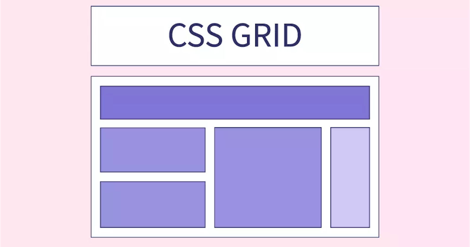


What is CSS Grid?
A grid can be defined as an intersecting set of horizontal lines and vertical lines. CSS grid is a layout system used for building two-dimensional layouts by using rows and columns. It makes layouts possible or easier than they are with tables.
CSS Grid v/s Flexbox
The most important thing to know is that flexbox is one-dimensional while CSS grid is two-dimensional. Flexbox lays out items along either the horizontal or the vertical axis, so you have to decide whether you want a row-based or a column-based layout. A flex layout can also wrap in multiple rows or columns and flexbox treats each row or column as a separate entity, based on its content and the available space.
On the other hand, CSS Grid lets you work along two axes: horizontally and vertically. Grid allows you to create two-dimensional layouts where you can precisely place grid items into cells defined by rows and columns.
Some Shorthand Properties
grid-template-columns: It is used to specify the size of the columns.
grid-template-rows: It is used to specify the row size.
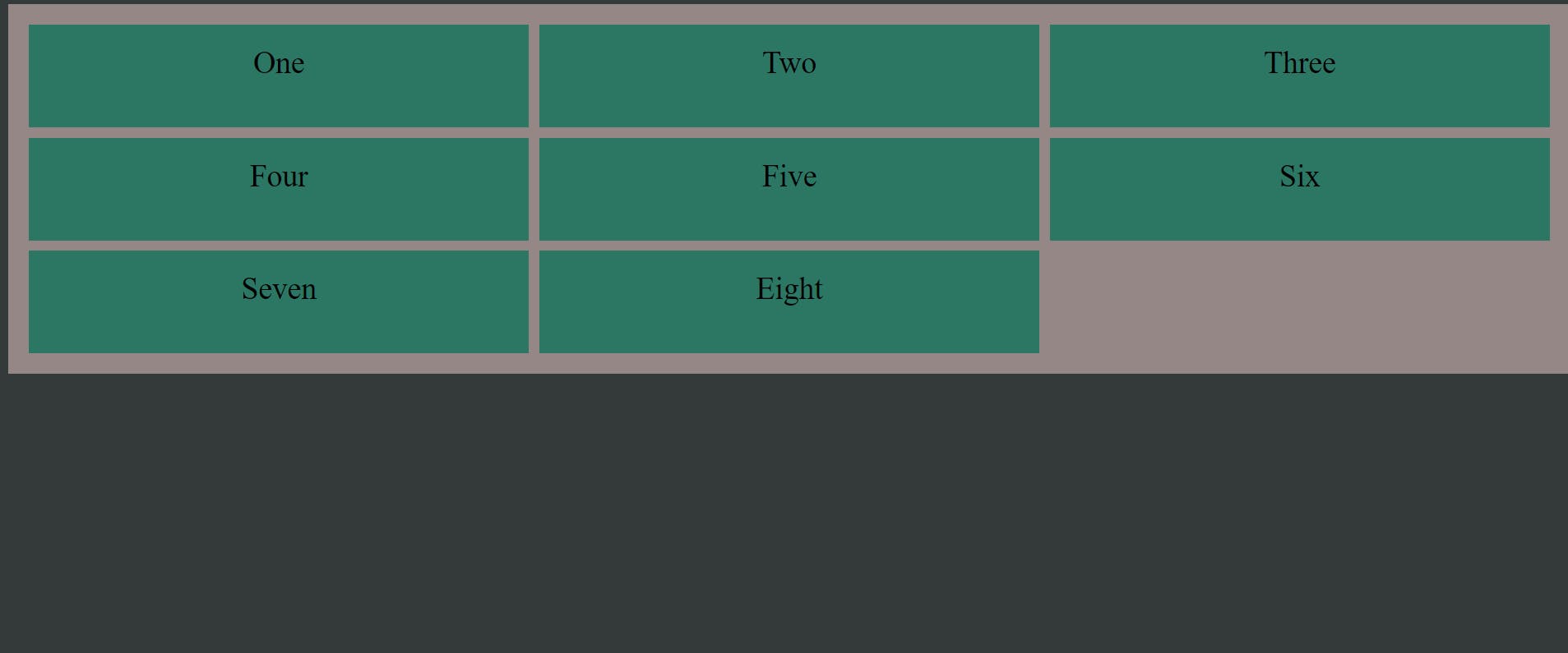
<html> <body> <div class="main"> <div class="number">One</div> <div class="number">Two</div> <div class="number">Three</div> <div class="number">Four</div> <div class="number">Five</div> <div class="number">Six</div> <div class="number">Seven</div> <div class="number">Eight</div> </div> </body> </html><style> body{ background-color: #343939; } .main { display: grid; grid-template-columns: 1fr 1fr 1fr; grid-template-rows: 100px 100px 100px; background-color: #968787; grid-gap: 10px; padding: 20px; } .number { background-color: #2c7664; text-align: center; padding: 20px 10px; font-size: 30px; } </style>
Result:
justify-content:
space-evenly: It provides equal space in between or around the columns.
space-around: It provides equal space around the columns.
space-between: It gives an equal amount of space between the columns.
center: It is used to align the grid in the middle of the container.
start: It is used to align the grid at the beginning of the container.
end: It is used to align the grid at the end of the container.